How much do you pay attention to the edges of your composition, before AND after taking the image, and do you have calm borders? One of the lessons I was taught early on in my career as the concept of “space” around objects and “space” between objects and the edge of the image. It’s a lesson that has stuck with me and I’ve grown the concept to include the concept of calmness around the edges of the image. Creating calm borders in your images can have a noticeable impact on your viewer and their ability to focus on the subject.
For me, “calmness” around the edges of an image translates in to the concept of not having too many distracting elements around the edge of an image that could draw the viewers eyes away from the subject. For most of our images the subject is somewhere towards the middle of the image and that’s where we want the viewers eyes to go. As photographers we work to direct viewers eyes through the way we create our composition (leading lines, etc) as well as using light and dark areas (in composition or post processing) to move them through an image and direct them to where we want them to look. I spend a good amount of time in the field and in post processing considering how someone will visually move through my images. There is science as to how humans perceive shapes, colors and light, which translates in to visual weight, direction, relative importance and all that good stuff in our images. I often consider a lot of that science when composing or processing an image in order to be the most effective at telling a visual story through my images. And, part of that science also informs the concept of having calm borders around my image.
So my point in all of this is……..when you have certain types of elements or mess around the edge of your frame, you can distract the viewer and pull their eyes away from the main subject, lessening the connection and impact of your image. Plus, having distracting elements around the edges of the frame also invites the viewers eyes to leave the frame, which is the opposite of what you want. That is why I strive be creating calm borders around my images.
Now, I know that as a landscape or nature photographer, nature is a messy place and oftentimes it’s hard to eliminate all distracting elements around your subject. I get it. What you can do though is work to reduce as much of the clutter and distraction as possible in your composition. When you are out in the field, one way to do this is to MOVE YOUR FEET and adjust your composition to be the best it can be at capturing your subject and eliminating elements that don’t add to your story. Another idea is to CHANGE LENSES and put on a longer focal length lens in order to zoom in on your subject. Before you press the shutter button, pause and take a moment to scan and evaluate the edges of your frame looking for distracting elements. Then after you’ve captured the image, in post processing, PAY ATTENTION to your edges and use the power of software to reduce/remove distracting elements through the use of Content Aware or a Vignette.
Examples
Here are a few before and after examples

Left is original image, right is cleaned up
In this beach image, the subject I want people to focus on is the beautiful curve in the sand leading out to Face Rock in Bandon Oregon. (excuse the processing, I grabbed these for this post without really processing them). At first glance I think that the leading line is strong and it will do what I want to direct the viewers eyes. However, upon closer examination, there are some elements on the right side of the image that could be distracting (circled in red). First is a piece of white sea shell on the sand. Our eyes are drawn to lighter objects and this one bright dot continually grabs my attention and pulls it away from the subject. Secondly on the far right, there are several lines in the sand that are visible and leading out of the frame. It’s subtle and subconscious, but these could pull on the viewers attention and draw their eyes out of the frame. So, using the Content Aware tool in Photoshop, I did a quick removal of these potential distracting elements to create a calm border on the right.

Here is a shot of a bull moose in Grand Teton National Park during winter. The main subject of the shot is its face and antlers, and more specifically its eyes. In animal and people shots, viewers are drawn to the eyes and they oftentimes become the primary focal point (and why they always need to be tack sharp) So, now that I decided where I want people to look, my job is to make sure that their eyes go there and one of the ways to help that is to remove distracting elements not leading towards the main focal point of the image. The moose was digging around in the snow for grasses so it had snow on it’s muzzle. Since that’s close to the main focal area, AND, it adds some context to the shot, I don’t see that as distracting. However, there are flecks of snow on its flank that I found distracting. Again, knowing that our eyes are drawn to light and light spots, these flecks of white can potentially pull viewers eyes away from the main focal area. I also decided to clean up a little bit of white fur (circled in red) again because of potential distraction. Then, at the bottom of the image, notice the grass poking up and the little bit of white snow showing through under its belly. This is a bright spot right at the end of the frame that can draw the viewers eyes. So with a little bit of content aware I cleaned up those bright spots. Then I finished it off with a slight vignette centered on the mooses head.
And finally….
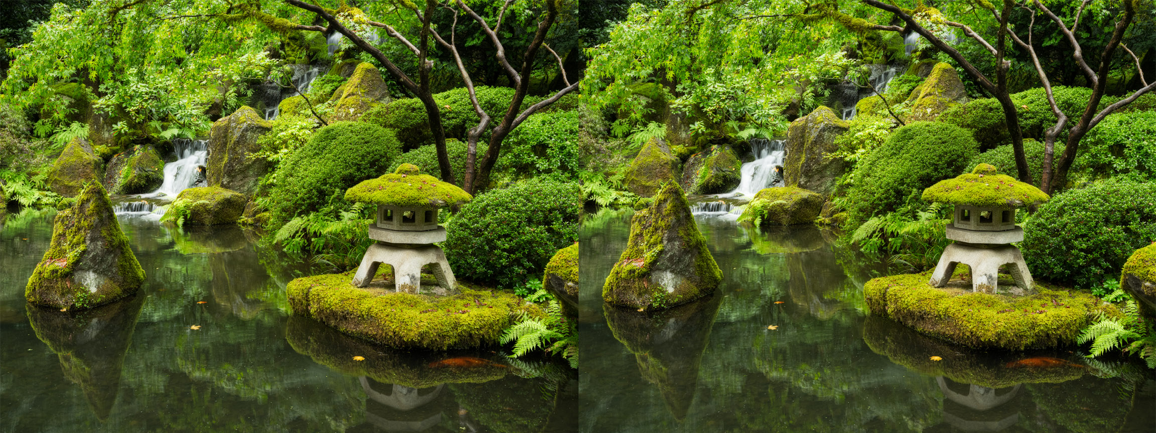
See if you can spot the areas that I’ve worked on to have more calm borders in the image. On the left is the original, on the right is the finished. OK, I’ll wait…….
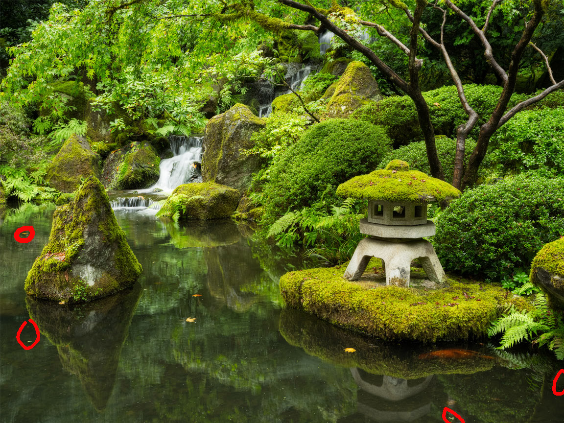
Here are the few areas I cleaned up in the image to create a calm border in the image. I mainly focused on bright leaves and debris which will capture the eye, but I also worked on a dark spot on the lower right which, because of it’s visual weight, might also grab the viewers eye. You might consider this just part of “general image clean-up” and it is, but it is even more important because it is on the edges of the frame and can draw the viewers eye away from where I want them to look.
Conclusion
I feel that spending some time focusing on the edges of your image and working to create calm borders can significantly improve your overall image and the connection or impact it can have on your viewers. It starts in the field with how you frame up your composition and then finishes in the digital darkroom and being hyper-focused and critical of each part of the image. Creating calm borders is a subtle thing…no big drama in what I do here. The old saying “pennies add up” is similar to how I approach image creation and editing. It’s small details and going that extra bit that can have a profound cumulative effect on the overall image. Building up lots of subtle changes makes for a better overall image in the end (without the viewer being able to spot what you did!) Next time you’re out shooting, or even processing older images, focus on creating calm borders in your images!



Leave A Comment