What is the importance of black levels in photographs and why should you care? Black levels, including both the intensity and quantity of blacks, throughout an image can greatly influence the perceived image quality and engagement by viewers. Many studies have been done on how we humans perceive colors, tones, shapes, etc in art, retail and technology and each has shown that enhancing black levels can create more impactful images.
The color black affects contrast, midtowns, highlights and shadows. It also affects colors, contrast and sharpness. This is true for both monochrome and color images! Blacks are critical for a well rendered image. As I’m sure you’ve seen some photographs online, those with “modern” or “instagram” types of processing where there is not a lot of contrast and the colors seem to be washed out. That’s a “style” for sure and it does appeal to folks. I view those images as temporal and not worth spending a lot of time viewing..that’s just me. Have you also seen, most likely from several accomplished photographers, photographs with lots of deep, dark blacks all throughout the image? Some might even say that the image feels “dark”. Images with overly applied black tones have their place, but the point of me bringing this up is to ask, have you noticed a difference in how you view these deep dark images? I have and what I’ve noticed is I have a different feeling for images with lots of black in them, compared to those that are washed out. That feeling led me to do some research on the importance of black levels and why we should all think about them as we expose and develop our images.

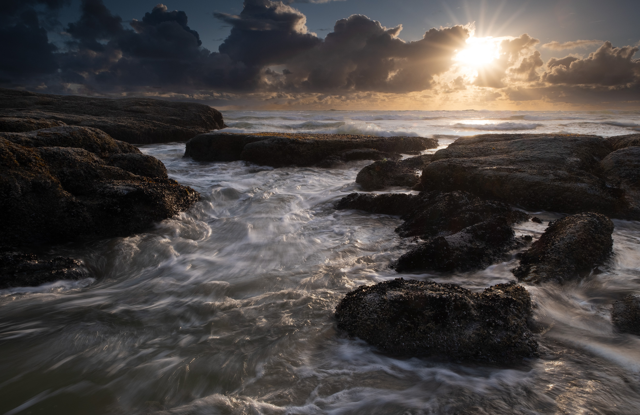
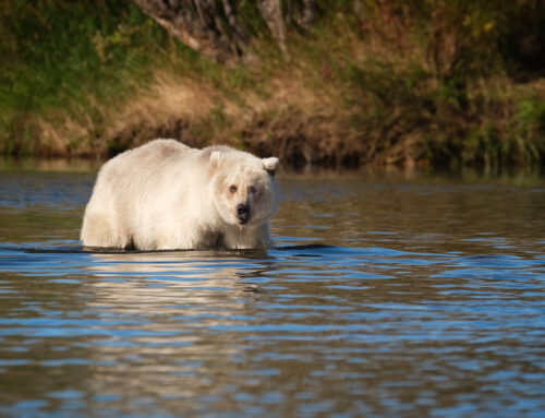
In the above image, notice all of the dark areas. These add visual weight to the image and adds to the overall “feel” of the foreground and entire image. The details in the rocks aren’t that important to the image, so I don’t mind if they are in dark shadows or in certain areas went to complete black. As I’ll explain further below, visual weight adds to a perception of “importance”, so having more weight in the image can correlate to more importance of the image.
What is the importance of black levels in our images? Why are they important? Here are a few of the reasons why black levels are critical for those seeking to create more impactful images.
Contrast and Sharpness
Black levels are a key component of the contrast ration in an image, which is the difference between th brightest white and the darkest black in an image. A high contrast ratio, achieved usually with deep blacks, enhances the perceived sharpness and detail of an image. When we sharpen an image in software, the simplest explanation is that the software is using “micro-contrast” at the pixel level to add “sharpness”…or “perceived sharpness”. It’s almost impossible to sharpen a pixel, instead, folks figured out that if they increase the contrast between pixels in a particular way, the result can appear sharper. The same is true across the entire photograph…when we have a lot of contrast, the image can “feel” sharper.
Perceived Image Quality
The importance of black levels has a direct correlation to the perceived image quality of an image! Studies have shown that people tend to prefer images with deeper blacks, perceiving them as higher quality. Darker tones, including blacks, can be described as having more “visual weight” than lighter tones. We subconsciously equate visual weight to importance in an image. Thus, the presence of a healthy amount of black tones lends itself to perceiving that an image is “more important” or of “better quality”, simply due to the presence of black tones.
Color Perception
Black levels are crucial for accurate color rendition and perception in images. Each color on the color wheel contains some level of black color and if the blacks aren’t strong in an image, a color might not be accurately portrayed in an image. Along with “full bodied colors”, the presence of blacks and darker tones around the colors can help them stand out more, adding more visual vividness and saturation when viewed alongside darker tones.
Sense of Depth
The importance of black levels are most noticed in the perceived depth in an image. Having areas of light and areas of dark, create a visual phenomenon that is perceived as depth when we look at a photo. Since we are often photographing 3 dimensional subjects and rendering them on 2 dimensional medium, having a sense of depth in our photographs is desirable. Anything we can do to bring a sense of depth to our images is a good thing!
Realism
If you seek to create images that reflect how we see the world, you need to have deep blacks in the scene. It’s as simple as that. When we look at the world, we see blacks. If we don’t see blacks in images we look at, it doesn’t feel natural. Having deep blacks in an image create a more significant sense of realism and thereby, more engaging images.
I hope that these reasons help to illustrate the importance of black levels in our images. Now, not every image has to be ultra realistic, ultra sharp, etc etc. There is a place for stylized images that aren’t 100% representative of how we see the world. However, if you are striving to create engaging, realistic, dimensional images, then having a solid foundation of blacks is essential to the image.
Tips for Working with Black Levels
Most photo editing programs have very similar, if not identical, tools to work an image. I prefer to use Adobe Lightroom, but if you use something else, take the concepts below and interpret them in to your own editing software. How much black you have in an image is completely up to you based upon what you want the finished photograph to look like. Some images can be very dark, stylized and dominated by dark tones, like the trend we see online. Or, you can simply have enough black levels in your photo to be as realistic as possible to how you remember it. It is really up to you as the artist. How much is up to you, and, how you get there is also up to you as we have many different tools to choose from.
Contrast
As mentioned above, the contrast between light and dark can add a significant amount of depth, sharpness and visual weight to an image. Simply moving the Contrast slider when developing the image adds a corresponding amount of whites and blacks to the overall image. Often times it’s as simple as increasing the slider a bit, until it looks right to your eye. This is the simplest and easiest method. However, it is not the most accurate. There may be times where you want to add a significant amount of blacks to deepen the darker tones in an image, but not add a corresponding significant amount of whites. When using the Contrast slider, this is considered a global adjustment, affecting the entire image and there is no way to separate the whites from the blacks. So use this cautiously!
White/Black Sliders
A more precise and targeted way to add blacks, and adjust the overall contrast of an image, is to use the Whites and Blacks sliders in Lightroom. Adjusting these independently of one another lets you dial in precisely how much of each you want based on the image and your final desired results. Using these sliders avoids the pitfalls of the Contrast slider, allowing you to adjust each one as you see fit. In Lightroom, what you can do is move the slider to whatever value “looks good” to you. Or, you can choose to be a bit more precise with it by using the “Option + Slider” technique.
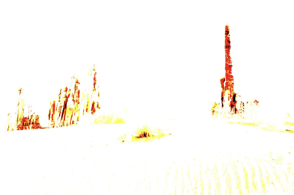
When you hold down the Alt(PC) or Option(Mac) keys and move the white or black slider, the screen changes from the image, to an overlay. As you move the slider, you will start to see colors depicted on the overlay. This is showing you where you may be clipping the blacks or blowing out the highlights. With the key pressed and slider moving, adjust it until just before you see these colors appear. This means you are right on the edges of the histogram, resulting in a wide dynamic range image. Once you release the Alt/Option key, the adjusted image will appear
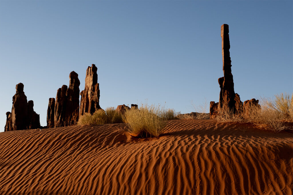
Here is the image I want to adjust my black levels on
When holding down the Option key + moving the Black slider, this is what you see. The areas in black are black tones that are completely clipped, pure black with a loss of detail. The red areas are those that are close to the edge of pure black. As you move the black slider, you will see these colors change.
For my processing, I find that I DO NOT move the whites until they are just about clipped. Often, this adds too much light to my images and I don’t find it visually appealing. I will adjust it until it looks “right” to me. For the blacks, I do like to add blacks until it just about clips and loses all detail, preferring to add more black than white to my images. As a brief side note, our visual system is more accepting of blacks that are clipped (loss of detail) than we are of whites that are blown out. So when I’m exposing and processing an image, I am more careful to protect my whites than I am my blacks.
Tone Curve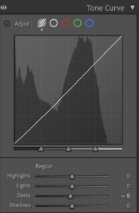
In Lightroom, there is a section of tools labeled Tone Curve. This is a common looking interface where you can drop points along the line and adjust the lights, midtones and darker tones in the image. It is a popular way to add an “S Curve” to an image, increasing contrast. Underneath the line you can also see a distribution of tonal values, seeing where you have tone information. One of the easiest and handy portions of this window though are the sliders located underneath the line graph. These sliders correspond to the different tonal values in an image. By adjusting the Darks and Shadows sliders, you can add blacks and darker tones to your image, targeting just those areas.
Tonality Masks
For those folks who may be a bit more advanced in their processing tools and techniques, the use of Tonality Masks can really target the darker regions of an image so you can fine tune the levels of the darker tones. Tonality masks are typically only used in Photoshop. Tonality masks select specific tonal values, much more refined than what’s available in Lightroom, and let you make adjustments to just the selected values. There are several folks who’ve made plug-ins for Photoshop which provide one-button clicks to generate these kinds of masks. For years I’ve used the tools from Tony Kyuper at Goodlight.us. He is one of the originators of these tools and continues to improve and refine them. For example, I use them to add contrast to a select range of midtones, or a small section of darks. It’s really fine tuned work.
Masks and Selections
All of the above techniques are focused on adjust a specific tonal range, no matter where it appears in an image. There are times when you want to add blacks, or visual weight to certain geographic locations in an image. The best way to do this is with Masks in Lightroom or Photoshop. You can use a Linear or Radial Gradient, Brush or Object tools in LR to select certain parts of an image. There are certain images where I want to add more weight, lets say to the bottom of an image to help anchor it, and to do that I’ll select a portion of the image and add black. This helps create a stable “foundation” for the rest of the image. There are times where we can add blacks, or weight, to areas of an image to help direct the viewers eyes. We know our eyes are drawn to the brightest part of an image, so I can darken areas of an image that I don’t want people to linger on, instead moving to brighter areas of the photo. Regardless of the reason why, adding blacks to certain parts of the image is best accomplished using masks.
I don’t normally add an excessive amount of blacks to my image, however, I do recognize the importance of black levels and strive to make sure I have “enough” blacks to add weight and perceived importance to the image. Here are a couple of examples to drive the point home. Let me know what you think of each
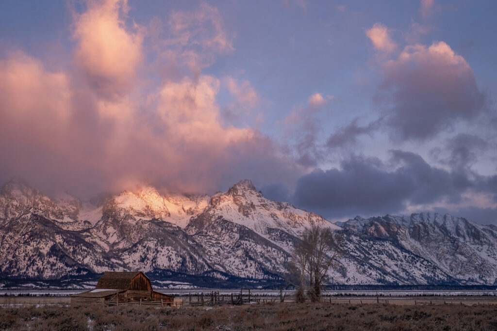
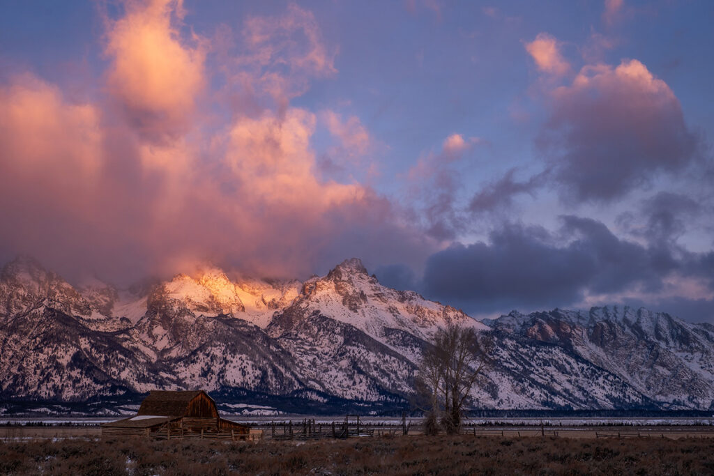
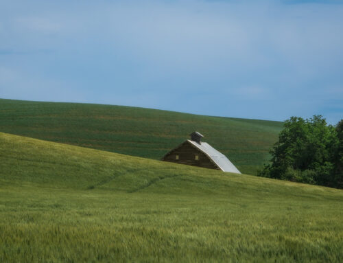
This first shot is the Grand Tetons and the Moulton Barn during sunrise. Since it is early morning, of course it will generally be darker, but I have decreased black levels, added whites and generally tried to lessen the weight of the image. Contrast that with the below where I’ve added blacks, deepened some shadows and really embraced the low light situation. I did NOT adjust any color sliders, but notice the increase in colors! This was simply due to adding blacks, which made the colors richer.
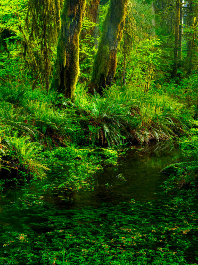
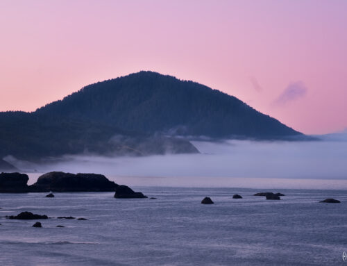
Now let’s look at a shot from the Olympic National Park. My goal is to create a more stylized version in the dark shot. Again, not something I typically do, so please forgive me if the processing isn’t great.
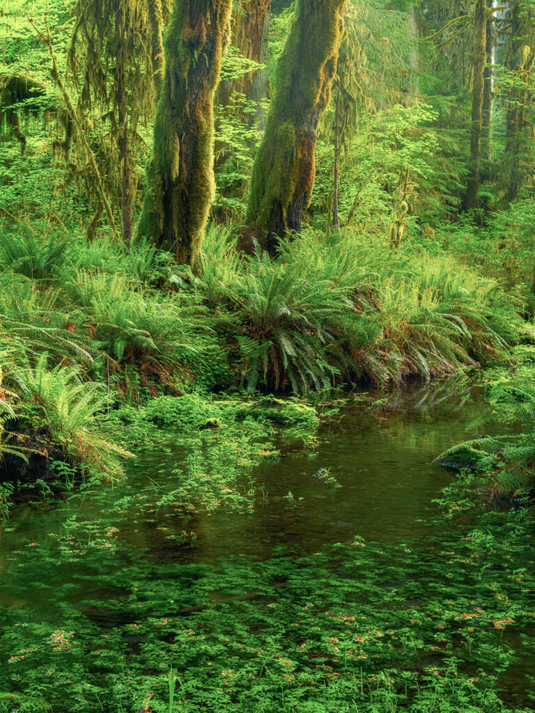
Above you see lighter tones, reduced blacks…sort of washed out to my eyes. This is fine if you like shots this way, but it lacks depth and rich colors, which are things that are important in finer quality images. Now, looking below, again I increased blacks, deepened shadows and added some highlights to certain parts of the image. We now see more depth throughout the image due to the contrasts between lights and darks, plus, rich vibrant colors.
I hope that this has helped you understand the importance of black levels in your photographs. Black levels help add visual weight, perceived importance, depth, sharpness and a particular mood to an image. Unless you are creating documentary style photographs, don’t be afraid to add your own “special sauce” when processing images, adding/removing light and shadows, stylizing it to show your inner artist!
Leave A Comment