I want to encourage you to take a chance and share your work with others. I recently had a wonderful experience that was informational and mostly positive and I wanted to share the experience and urge you not to shy away and to take a chance to share your images. Whether it’s online on your social media channels, or on photographic specific sites, and even during image reviews in a photo workshops, take a chance and put yourself out there with your images and see what happens.
For some, I know it can be scary or just not feel good, opening yourself up to others comments, maybe even saying they don’t like your photographs. I get it. But that’s part of what happens when you take a chance and put yourself out there. Sometimes negative feedback can feel uncomfortable, but if it’s given in a constructive way, it can be an incredible way to learn and grow your skills as a photographer. If the only thing you hear about your images are “great”, “fantastic”, “beautiful”, “wow!!!!!” etc, that might make you feel good, but it won’t help you grow as an artist. So put yourself out there and take a chance to learn and grow.
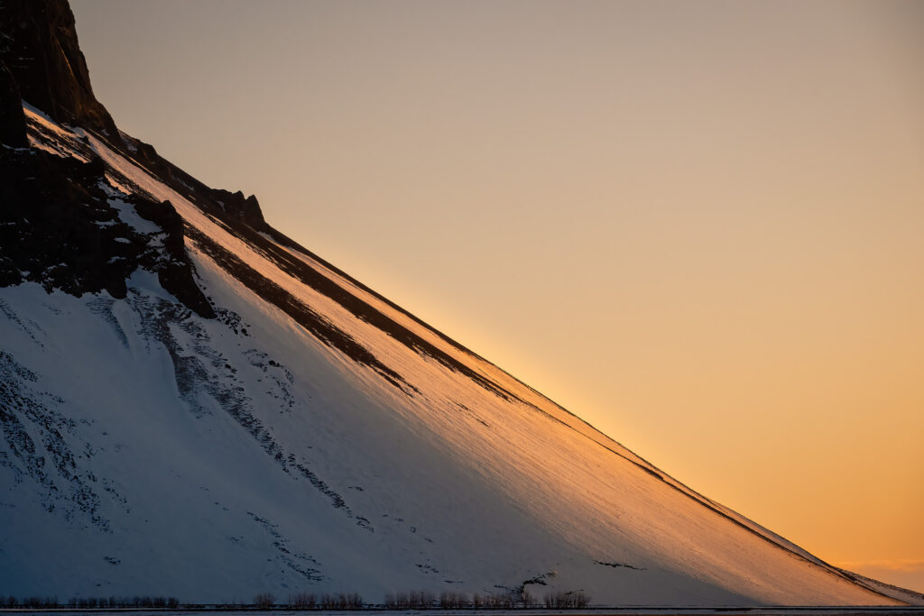
I recently posted the above image on Nature Photographers Net, a wonderful online forum of photographers. I’ve been involved there for many years and typically the kind of feedback I get is thoughtful, insightful and oftentimes instructive for how I can look at my images differently. In this photograph, I was at an area with a gorgeous waterfall that was encrusted with ice. As folks were shooting the waterfall, I glanced over my shoulder and saw this scene. I was drawn in by the golden light on the mountainside and the angle of the slope. I love simple or minimalist photographs, working to distill a scene to its core elements of why I’m shooting it. In this scene, it was the quality of the light and the angle of the slope, that’s what drew me in. My thoughts at the time was that it’s more of a “design study” than a “landscape photograph”. I was very intentional about the amount of rocks in the upper left, where the slope left the frame on the right and very conscious and intentional about the trees at the bottom of the frame. I shot it several different ways but this is the one I settled on to process and post. I know these kinds of images are not for everyone and that’s OK. I do enjoy them and am not afraid to shoot them and take a chance to post them for reactions and feedback.
I wanted to take a chance and put this image up which I knew might draw mixed impressions, that could spur discussion. And as an byproduct of that, I might receive some negative feedback about it. I was OK with that and ready for whatever came my way. My whole goal was to see if others saw in this scene what I saw, what drew me in. Not that I wanted their approval, I wanted a better understanding of how other people see this scene and interpret what I was trying to do in my photograph. (by the way, feel free to add a comment below with your impressions/thoughts/feelings about the image!). So I put this up asking for peoples feedback about the image, nothing specific, just their thoughts about it.
Right away, I got a comment from someone who said it didn’t work for them. There was too much negative space, the trees at the bottom shouldn’t be there and they didn’t like it. Their suggestion to salvage the image would be to crop it, removing some of the elements that I found important to me as the photographer. Here is the suggested crop below.
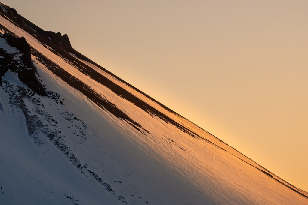
What they are suggesting is to create more of an abstract image, removing a lot of the space, the trees, some of the rocks, etc. Honestly, I think the image works OK, but it is not what I intended when I shot it. I think it completely changes the image away from what I wanted and what I like. I was gracious to the commenter and responded to some of their points as best as I could, in a professional manner. Essentially, “thanks but no thanks”. I’m not surprised I got this initial response as it is not an “easy” image for some folks to process and interpret. Some folks are more literal and need a defined subject and a fore/mid/background and all the other elements of a “good” photograph. This is what can happen when you take a chance and I knew full well I would get some of this because the image I chose to post was “different” and broke some of the “rules”.
The next comments were much more interesting to me and more informational and helpful for my artistic growth. The comment I enjoyed the most was this one, “Some people might call the sky in this image negative space but to me it’s not. Think about it this way, the sunlight has traveled 93 million miles to reach earth, then it traveled another 700 miles through Earth’s atmosphere to reach this slope, if not for that space, the slope wouldn’t be lit up so nice. The space has purpose and is key to the entire scene.” Somebody really got in to the moment and interpreted the scene from a galactic perspective. Further comments from the same poster included, “I really like the composition as presented, the diagonal line is simple and pleasing, I see one image with three elements in harmony with each other ” Ah yes, they get what I’m trying to do here. I connected with at least one person, so to me that is success and rewarding.
I won’t bore you with all of the comments, but a few notable ones to me were; “Overall, this image doesn’t work for me because it doesn’t lead me anywhere. That is, it doesn’t engage my imagination. Perhaps others will react differently.” , “my main suggestion here is bumping up the light that is striking the slope.”, “The one thing the bottom row of trees does however, is provide scale, context and location. We know what we’re looking at. Having that cropped out the scene is more graphic and abstract. So in the end it just depends on what you want to present.”, “I kinda like the yin-yang approach to the design, despite the negative space. In this case, I think it works.” There were lots of other comments, but these give you an idea of the cross-section of comments I received.
Beyond the image, I am overjoyed that I sparked such great discussion and caused the commenters to pause, examine, think and then formulate a thought out reply. That was fantastic for me and made me quite happy. I even had a couple of comments from folks who had “learned” some things from the discussion, different ways to look at an image. Wow, now that’s putting some good out in the world.
When I shot this image, my goal was to take a chance on it and see if it would work when I got back home and reviewed it on the big screen. As I reviewed my images, I came to this image and I liked it even more than when I originally shot it. The light is magical, the angle of the slope is pleasing and the composition is different enough that it can get someones attention. This is what can happen when you take a chance. I routinely encourage my clients and friends to post images that they are not sure about, ones that they may have questions about, or aren’t sure how others might interpret the image. You don’t learn anything if you only post “winners”. Take a chance and put yourself and your art out there. In my opinion, it will help you…
- Hear feedback about technical and aesthetic qualities of the image that you might not have seen so you can improve next time you are out
- Be able to “see” your image differently based on feedback which may alter the “story” or intent of the image. Knowing more of how others “see” helps me to read a scene and compose the shot in ways to better convey the story I’m trying to tell.
- Process the image differently based upon the feedback to accentuate/de-accentuate parts of the image
In the end, I kept my original image, with the trees at the bottom and the slope that is “just right for me”. I really like the image and don’t want to alter my original intent. I did incorporate one piece of feedback into the final edit which was the amount and vibrancy of the yellow light on the hillside. Several folks said there should be more, and since it was one of the main elements of the photograph, I thought those were fair comments. So I gently increased the yellow a bit on that slope to bring more attention to that one area of the image.
Go ahead folks, take a chance and put yourself out there to get constructive feedback. It’s one of the best ways to grow as an artist.


Leave A Comment