Sometimes simple is more powerful than complex
I’m going to leave that sentence out there for a bit. Go ahead, read it again.
In this fast paced world with ever increasing noise, the general trend is to ratchet up the wow factor in the pursuit of eyeballs. Whether in advertising, news, politics, and even photography, there is a general trend to create more WOW so that it will cut through the crowded landscape and loud noise.
I have found that as the noise has increased and the over-the-top wow factor in images has gone through the roof, I am moving further and further away from that and seeking more serenity, more simplicity and an inner strength in my images through the use of stronger compositions and more insightful translation of my subject.
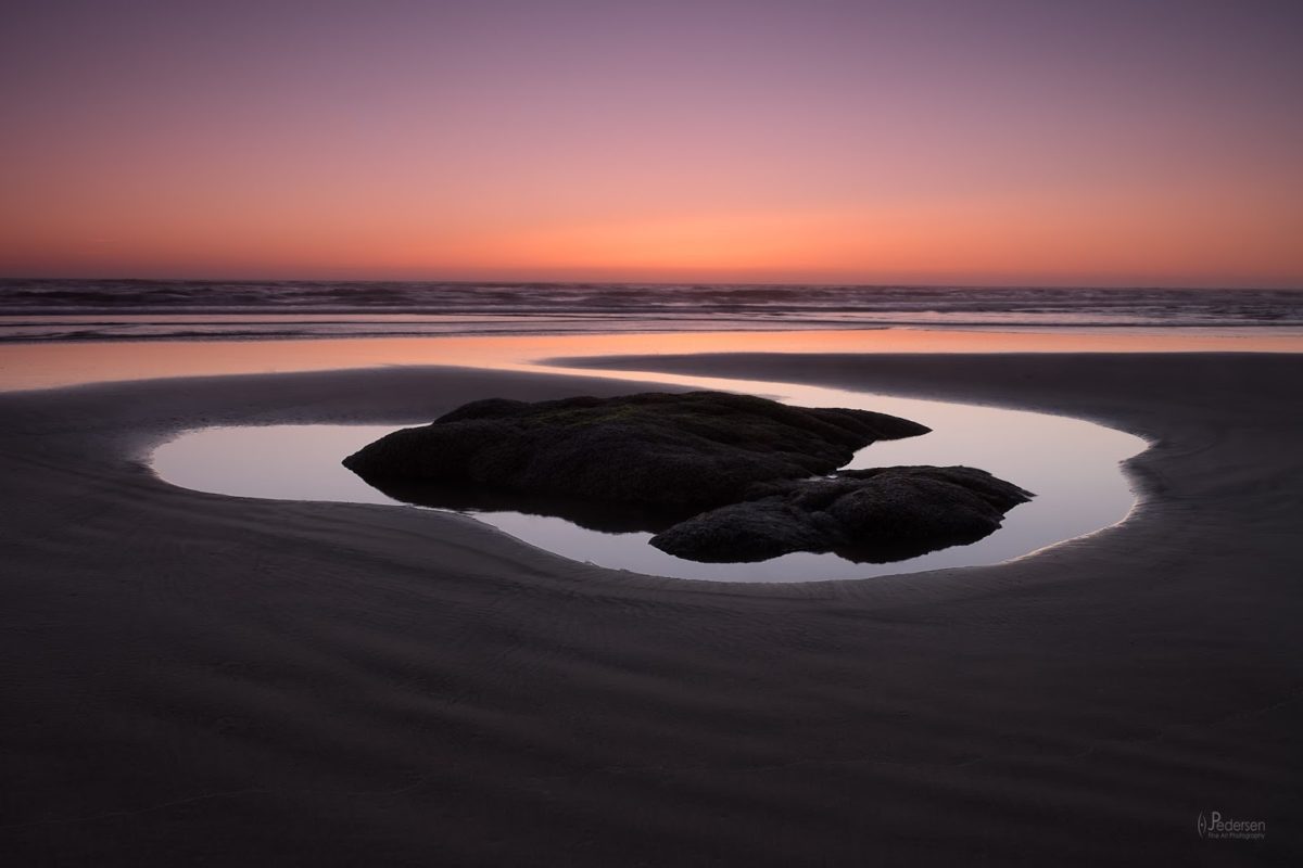
In the above image, a seemingly very “simple” shot from the Oregon coast, I find that it can be incredibly strong and even more impactful than some crazy light from the latest hot destination. Simple beauty, expertly composed and crafted brings a deeper sense of connection to the subject, can bring more peace and serenity to the viewer, and challenges the artist to “do more with less”
For those that can slow down and look at a simple image, you can see that things can be anything but simple. And, many times, it’s these seemingly simple images that can be the hardest to create. The wind had been blowing all day and if there were any ripples in the water in the pool, the image would not work. Betting on the wind dying down while there is still sunlight in the sky took timing. Putting the subject smack dab in the middle of the frame, typically a photographic no-no, works exceptionally well in this shot because of the simplicity and weight of the rock. The “right” positioning to frame up the shot was a very thoughtful process. Trying to get the best angle for the curve of the pool, then couple that with the shape of the rock…those two elements needed to be in harmony for the shot to work. All which then tie in to the river of water leading from the pond to the ocean, giving the viewers eye an easy path to the back of the image. The height of the tripod played a role in this composition too. If the tripod was too low, the river of water would have been cut off by the rock and the angle on the pool/rock combination wouldn’t highlight them to their best. If set any higher, the angle starts to feel unnatural to the viewer. Shot just below eye height allows the viewer to feel as if they are part of the scene. Then of course, there is the in-camera technical execution of the image which has to be spot on. As you can see, these seemingly “simple” compositions are anything but simple to execute just right to convey the voice of the photographer.
In this age of constant shouting, ever increasing assaults on our senses, sometimes the voice that speaks softest and most poignantly is the one that gets heard.
(originally published 8/8/16)


Leave A Comment