Over the past few weeks, I’ve been experimenting with the Capture One editing software in an effort to learn it and evaluate if it is any better than using Adobe Lightroom for my cataloging and initial edits. I’ll be honest with you, right now I don’t have a conclusion to this question as I’m still learning Capture One and uncovering many of it’s features. I’m still in the initial phases of taking a look at Capture One and am working very hard not to be pre-disposed on an outcome of what I find. I don’t have a desire or conclusive need to change away from Adobe. For the most part I am quite happy with their tools and what I can get out of them.
So much of what I look for in image editing software relies on my personal preferences and needs as a photographer. I want a good cataloging tool that I can keyword, sort/filter, and of course organize thousands of images spanning many years. I want good integration with Adobe Photoshop because I still do the majority of my image editing in Lightroom because I take advantage of advanced plug-ins such as Luminosity Masks in Tony Kuypers TK9 plug-ins. Photoshop continues to give me much more fine-tuned control over my editing and it is still my tool of choice for most of my images. I will say that Lightroom has come a long way in the last couple of years at being a great image processing program, not just a cataloging tool.
Adobe Is Still King
Adobe Lightroom and Photoshop are still king in the image editing space. No matter how many upstarts come along, Adobe sells more subscriptions in a month than all the others combined across many months. Why? Well, the software works and it works well. They’ve had years to fine tune the interface and the engine powering both of these tools. They have years of name recognition as well to boost awareness and confidence in the software.
I’ve tried all of the major players as they came out. For example Luminar was a great tool to begin with, but their development path took them too far away from what I wanted and needed as a still photographer in to a lot of batch processing, AI and more “instagram type” features that may appeal to the masses. A lot of these upstarts come on to the scene as an “Adobe Killer” but soon find themselves facing a brick wall preventing further growth, so they pivot and find ways to be a plug-in to LR or PS or remain as a bit player in the crowded field of mobile processing apps.
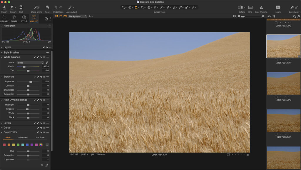
Capture One
Capture One came on the scene with a lot of fanfare and received a lot of initial positive press. When it came out, I wasn’t one to initially jump on it. I had tried so many others in the past, I resolved to just wait and see what happened with it. Well, over the last couple of years, I’ve watched as it’s user base grew and the positive comments continued to pour in. In addition, if you are a Fujifilm shooter, the results of Capture One appeared to be better with Fujifilm files than what Lightroom would do. Since I still shoot, and love, Fujifilm, this particular point really caught my interest. I know with Adobe, there are so many camera profiles that they need to program for and Fujifilm, having a smaller amount of market share than the big 3, doesn’t receive all of the love it could from Adobe. Because of this I’ve often wondered if I could be getting better results from Capture One than my current Adobe tools.
I recently received an email from SmugMug (I am a customer of there’s) which informed me I could get a full copy of Capture One for 3 months for free. I thought about this for a few days and then finally decided I had the brain space, and time, to give this a shot and see what all the hubbub was about. I proceeded to download and install the software. During this process, Capture One did require me to create a full profile, including credit card info 🙂 so when I “forget” to cancel the trial, they can continue billing me. Speaking of billing, this is a subscription software similar to Lightroom. The big difference here is that the cheapest subscription is $14.92/month billed monthly or yearly. They do have more expensive plans that include more applications, such as Capture One Mobile, Live, etc. Even at its cheapest, it is still much more expensive than the photographers bundle from Adobe at $9.99/month. If you do the math, they are 50% more expensive per month than Adobe, so you also need to figure in the cost in to the benefit analysis. Is the benefit of Capture One that much greater than what I get from Adobe?
Initial Impressions
I had heard over the past couple years that there may be a steep learning curve to Capture One but once you get comfortable with the interface, it is intuitive and easy to use. To be clear, I think I am still on the very steep portion of the learning curve. It has taken me a long while to learn how to navigate and find the tools I want to use most. I fancy myself pretty savvy on computers as I spent years as an IT professional, yet still I struggled finding some basic tools and organizational items that I would expect to be readily visible and accessible. I am starting to understand some of the logic for how they designed the user interface, still, it is not coming naturally to me.
When I first started working with it, I could only spend about 30 minutes with it before I was frustrated and wanted to go back to more familiar Adobe territory. I have forced myself to return to it every day or so and gradually I am starting to gain some learning momentum and feeling a bit more comfortable with the application. I am starting to see some of the potential of the user interface and how much is available at a quick mouse click. Things that are buried in Lightroom menus are quickly accessible. I can see that there is a lot of efficiency thought put in to the design of the application.
Having Layers functionality in Capture One is a welcome thing for those who don’t want to work in Layers in Photoshop. I have yet to explore the functionality of this area yet, but am encouraged to see it. Lightroom sort of has layers when you utilize the masking tool, but I would consider these not full-fledged layers in all operations.
The more I work with program the more I see the appeal of it. Sometimes it’s just little things like having an indicator appear in the histogram indicating the tonality underneath your cursor. As you move your cursor to different parts of the image, the indicator will tell you quickly what tonal range your looking at so you can make quick targeted adjustments using the right tools for that tonal range. The Loupe feature is a nice one as well. A bit better than Lightroom. With the Loupe cursor selected, put your cursor over an area in the image and hold the left mouse button. A small fly-out bubble appears with a zoomed in snapshot of that area of the image. It allows me to quickly move to different areas of the image to check focus. In Lightroom, what I found myself having to do is zoom in the entire image and then drag the image around to check different areas. Its a subtle difference but a welcome improvement over what I’m currently using.
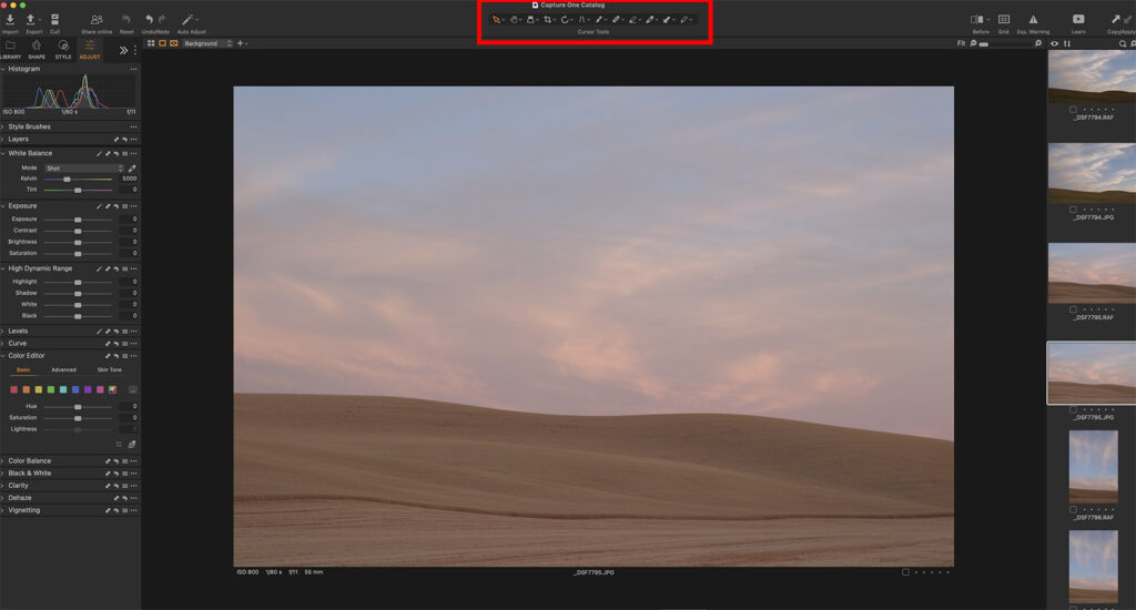
One toolset that I really appreciate is how they have arranged so many functions in the Cursor area of the toolset. This allows a lot of speed, power and flexibility right in your main working space. Some of the tools available here are Move, Loupe, Crop, Rotate/Straighten, Perspective Change, Masking, Healing, Erasing, Color Picker…and the list goes on and on. Yes, these are all available in Lightroom, but I feel that Capture One has done a nice job of grouping them in one spot that is very intuitive to use.
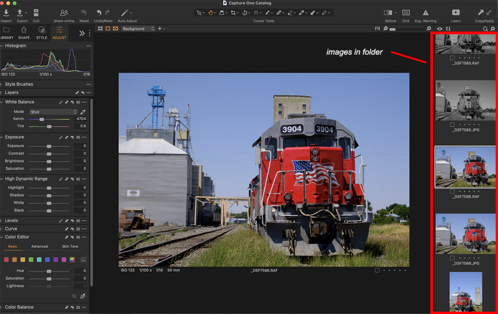
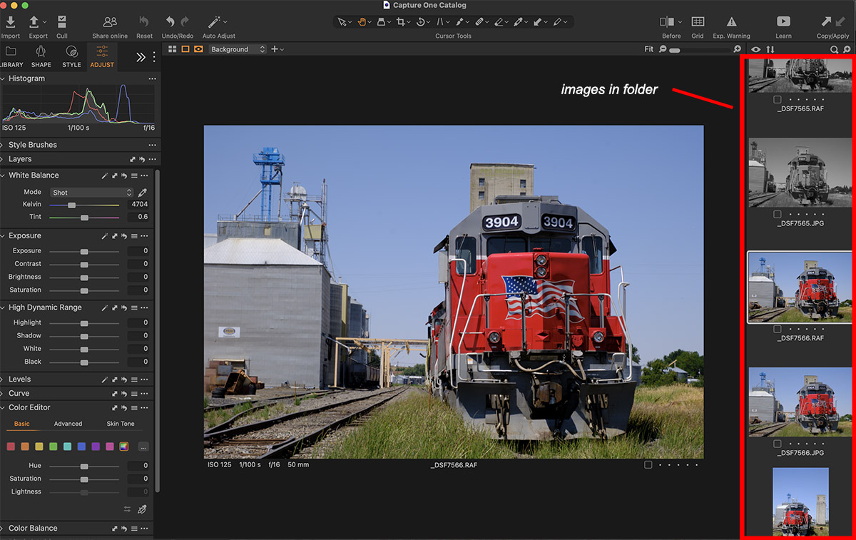
One of my biggest dislikes so far is the Library. I would like to see a tiled arrangement of all the images in a folder, like the Grid view in Lightroom. I want to quickly scroll through the images looking for a particular set of images in a folder, say, from a specific location on a workshop. In Capture One, all I’ve been able to figure out is that the selected image is shown large in the center and the rest of the library images are stacked in a narrow filmstrip along the right side of the window and I have to scroll endlessly to get see images from deeper in the folder. Try as I might to “find” a way to change this, I haven’t been able to yet. Now I know many of you will say “just google it”, which I will do. But what I’m trying to do is learn the software and judge its intuitiveness as a first time user without resorting to “cheat codes” to fast track my learning. Because catalog management and keyboarding is a key component of managing a large volume of images over the years, the Library function is very important to me, enough so that it is often a deal-killer when I’m looking at new software. I’ll be spending more time in the Library to better understand it’s full functionality.
Performance
I don’t do scientific measurements of computer/software performance and I don’t want to pretend to. However, I do have impressions and “seat of the pants” feelings and so far it feels like Capture One is a bit slower than Lightroom on my Apple iMac running lots of memory and fast processors. It’s not substanstantially slower, however, it’s enough to be noticeable. I don’t think it would have a long term impact on my workflow, but I did find myself waiting a bit more than I’m used to for certain operations to complete. When I was a hobby-ist photographer speed of operations didn’t matter much. Nowadays though, I find that having a very efficient workflow with not a lot of wasted time is more important to me and is something that I am sensitive to when processing images.
For Now
For now I’m going to keep trudging up the learning curve and learning more about this program. I am intrigued by it for sure as it looks like it has some wonderful potential. I really don’t have any desire to change away from Adobe Lightroom, nor do I want to pay a higher monthly price for using my software. Yet still, there are many folks who are quite happy with this program and I wanted to see what Capture One was all about. As I learn more, and before my trial period ends, I may share an update of my learnings and any final conclusions I might have.
If you are a Capture One User…
I would love to hear some feedback from you. What do you like? What don’t you like as much? What was your motivation for switching? Really, anything you’d like to share.



Leave A Comment