Have you noticed the trend that’s been going on for a while now, presenting dark photographs? The subject itself isn’t dark, it’s the processing and tonality that comes off as dark in the image. The photographer has a vision to present a landscape scene with very dark tones, almost no midtowns and then some pops of highlights. It’s a definite “thing” amongst many photographers, so much so that it has been clearly notable and commented on by several folks. What is it about dark photographs that make them a thing? To be honest, I’ve looked at them and wondered, so I put the topic in the back of my brain to bounce around in there for a little bit until I felt I had a bit of an understanding of what’s going on here.
Please don’t mis-understand me…I’m not for or against dark photographs. In fact, in certain scenes, the treatment is very pleasing. For me though, it got me thinking about why this became a thing and how we as humans respond to these, say, compared to the white-washed light photographic style that was popularized on some social media channels. I believe that there is a definite reaction and effect going on in our visual systems that respond favorably to darker toned photographs. Some of it can be explained cognitively and some of it is just a visceral reaction. Don’t worry, I won’t go in to a deep-dive technical explanation here! I’ll keep things a bit more on the surface and talk more about feelings when we view dark photographs. I’ve recently been thinking about the tonal spectrum in our photographs and the role that darks (black) plays in our images, no matter if they are color or monochrome. Dark tones provide some real benefit in our images and ones that we as photographers should appreciate and acknowledge as we compose, capture and process our images.
As a brief aside, I again looked towards music and audio systems as a way to help organize my thoughts in the photographic world and I’ll share a bit of that thinking here. Think about the role of sub-woofer in an audio system. They are designed to play a very low frequency and oftentimes don’t produce discernible notes like a guitar or drum would. The subwoofer provides a foundation, or a floor, for the rest of the music to stand on. It has weight, solidity, slam, and impact. Without it, the rest of the musical notes seem light or perhaps tinny sounding, lacking a rich and full timbre. Perhaps the most valuable aspect of having a subwoofer in the system is that besides playing the notes in its frequency range, it frees up the rest of the notes from trying to carry the “auditory weight” of the subwoofer so that, IN OUR MINDS, the other notes seem more full bodied, dynamic and in themselves, have more weight. By providing a solid foundation, the subwoofer allows all the other frequencies/notes to be perceived as being more solid, more full and more lush.
I feel that the same holds true in photographs. We need deep dark tones in our photographs to provide a secure and solid foundation for all the other tones to stand on. Ansel Adams always preached to have the full range of tonal values in an image, that all are important. We know about Mids and Lights and how they work in our images, yet I think Dark tones are often under-appreciated by many. Having a solid foundation of dark tones, in my opinion, lets the rest of the colors shine more brightly and the perceived color values have more saturation and weight. From science and visual perception studies, I’ve learned that our brains desire to see a full tonal range, it’s what we’re programmed for. Images that are too light, or too dark, don’t resonate with us as viewers as those with a full and balanced tonal range.
Dark tones are perceived as heavy, carrying a lot of visual weight and can occupy a lot of physical space in a photograph without seeming awkward. They are part of the full tonal range that Ansel speaks about and without them, many photographs seem to have less impact and visual resonance than those with darker tones. This is just my opinion, yours may differ and that’s OK. This trend of darker photographs features many images that have a good portion that are way left on the tonal spectrum, with lots of physical room devoted to very dark to black tones. If we had an image that devoted that much space to very light to white tones, a dramatically different perception of the image would occur. Colors would be washed out, the image more “fleeting” and temporal as compared to the darker image that seems more “solid” and “permanent”, and perhaps therefore, “real”.
Touching on the topic of how a healthy level of blacks in our images can boost other colors…besides the foundation and solidity that is visually imparted by darker tones, everyone should realize each color (except pure white) is made up of varying percentages of black. If we as photographers don’t include, through our exposures, a measure of black, then this will negatively impact how each color is represented because we are lessening the percentages of black in each color. I’m not saying to drastically underexpose an image, but what I am trying to say that we should value and consider the black levels as much as we do the whites/lights.
We’ve all heard the old expression to “expose to the right”. I’ve never been a proponent of that! In my photographs, I typically tend to expose to the left, slightly underexposed, maybe 1/3 of a stop. I feel that this does a better job of protecting the highlights, AND, captures a healthy amount of dark tones in the image. In Post, darks are easier to recover than lights, so that’s why I tend towards the darker side of exposure, plus producing a richer palette to work with in the darkroom.
As I’ve been pondering this topic, I’ve also paid attention to how people respond to images I post based on the tonal ranges in the images. Granted, this is non-scientific, but I noticed a markedly larger positive reaction to darker toned images that lighter, or neutral, toned images. Now I’m not out seeking likes or accolades, but I was paying attention as more of a psychological or social study. I thought this was an interesting result and it validated some of the ideas that had been bouncing around in my head.
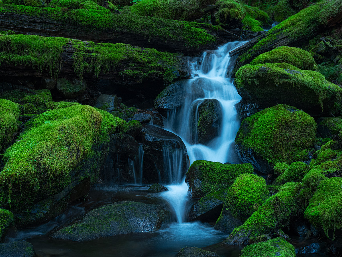
Here is the latest dark photograph that I posted that received quite a lot of positive reaction. To be honest, I was a bit surprised at the reactions of folks and how much they liked it. I got words like “lush”, “serene”, “wow”, which are emotional, visceral responses to the image.

This image was captured in Olympic National Park during the morning, before the sun had risen above the mountains. It was light out, much lighter than what is depicted in this image. So in terms of “photo realistic” this isn’t. I didn’t set out to make a dark photograph, but through the application of some effects, and the mood I was in at the time, it came out darker than I normally process images. When I finished processing, I liked it enough to keep it and share it. The darker tones add that weight and foundation, making it feel more “solid/real” and they remove a lot of the visual clutter around the image so the viewers attention is focused on the water, which is the subject and story in this image.
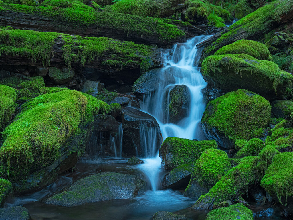
Just for fun, I took the same image and did some work on the dark tones to produce a lighter image. How does it “feel” to you? To me, it feels less substantial, lighter in weight. I see more of the visual noise amongst the rocks, AND it feels flatter, less three dimensional. That’s just my initial reaction on seeing it. I’d be curious to hear yours.
I’m not advocating that you need to run out and create dark photographs to be successful or popular. No way! Do what you love in whatever tonal range makes you happy!!!!! What I hope to do is just get you to think a little bit about the darker tones in your image and know that they are important in supporting the image as a whole as well as all the other tones in the image. Darks can bring visual weight, slam and impact, foundational support and even a sense of mystery and intrigue to an image.
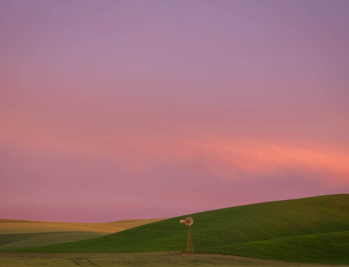
darker tones throughout the image
A healthy dose of black and shadow tones in the image to bring depth and weight
“The piano has eighty-eight keys, and you have to be able to play all of them. And the range of white to black is analogous to the eighty-eight keys and you have to be able to play all eighty-eight keys in that palette from white to black.” ~ Ansel Adams
Leave A Comment