Why do some images “work” and others don’t? Unfortunately there is no one, simple answer to this. Many factors go in to making an image resonate with viewers and it’s not down to camera specs or the latest software. I will admit that big, splashy ultra-colorful images do have an initial instant appeal to viewers, however, once you get past the big color, what is the image like, what is its story, how well does it capture the essence of what the photographer was trying to convey? That’s where the art of composition comes in.
Now, each photographer has their own vision of what they want to capture and how they want to capture it, so I won’t touch on that topic. however, there has been a lot of research on how people process information (color, shape, etc) visually that can be beneficial to us as photographers.
One of those things is BALANCE in an image. The best way for me to describe visual balance is when the information in an image is equal, or feels equal, from left to right or top to bottom, depending on the image and orientation you’re shooting. It doesn’t have to be balanced side to side AND top to bottom….either one by itself is fine to bring balance. When someone is viewing a balanced image, subconsciously, they feel “better”, more positive, etc. about that image, which lends itself to making it “work” for the viewer. For most folks, it’s not a conscious thought that the image is balanced, it’s more of a feeling about the image, something that most folks can’t describe, yet they know it’s there.
This is not to say that an unbalanced image won’t work….they can and do, often quite successfully. The trick, in my opinion, is when you are shooting an unbalanced image, make it overt to the user so that they know it was intentional to have a skewed balance of information in the composition. You can use the unbalanced technique to bring some visual tension into the composition, or bring some uneasiness to the viewer to help elicit the emotional response you are looking for.
The way we can achieve balance in our images is in how we choose our compositions. Where we place ourselves in relation to our subject…….what elements we include (or don’t include)……how we are oriented towards each of the elements in the image…..the number of elements in the image……the weight of each element in the image……etc…. And, even the amount of light versus shadow areas in the image can bring a sense of balance to an image.
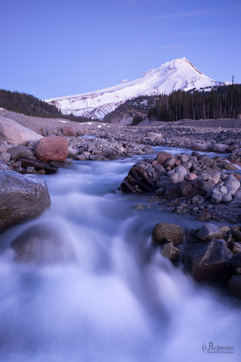
As an easy example of balance, here’s an image I shot during Spring on the east side of Mt Hood. The subject of course is the mountain and the water and the story I am telling is the melting snow off of the mountain, into the river and onwards to feed the landscape.
Now, what is it about this image that makes it work? Well, the technical aspects of the image are good. It’s sharp and properly exposed and there are no glaring elements that are distracting from the viewer. Those are all conscious evaluations of the image, things most viewers can look for and see for themselves. All good so far yes? Now, at a deeper level, one at which most folks don’t really think about, this image also has balance. Can you see it? Balance on each side of the image that helps to bring a sense of symmetry and order, which in turn helps the image be more pleasing to the viewer. Granted, like all creative endeavors, this is in the eye of the beholder, but I see it.
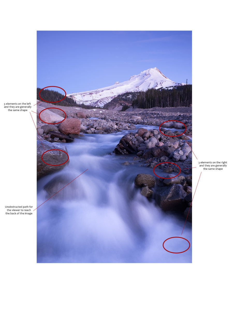
Below I’ve marked up the image for you to see what I’m talking about….(click on the image to see larger size)
On the left side of the image, there are two rocks that are coming in from the left side and each one of these rocks are of a similar shape. These rocks and their shape, they are very similar to the forested hill in the background. Sightly rounded, a sense of solidity, etc. All three elements feel very similar in shape and their positioning within the frame is aligned and their relative weight is very similar. Now on the right, the balance is achieved with the water. In the lower right corner there is a strong element of water. Just above that the river takes a slight jog to the right creating an inlet and just above that there is a larger inlet. Again, I’ve got three elements, but in this case they are not quite of equal visual weight in the image which I think still works because as a viewer, I subconsciously know it’s water and can still feel the balance. So, I ended up with 3 similar elements on the left and 3 similar elements on the right creating a sense of balance in the image. And lastly, there are no visual obstructions to the viewer to reach the back of the image. As you look at the image, your eye follows the water from the front of the image all the way to the mid/back of the image, to the second main subject, the mountain. And as you travel there, you are surrounded by a sense of balance and symmetry that makes it a pleasing experience.
Can you achieve this balance with elements that are not similar is shape or structure? Yes you can! it’s all about visual weight, patterns/textures and light/dark to achieve balance.
Next time you are out creating images, take time to consider the balance in your compositions and try out different techniques for creating balance, or purposefully creating an imbalance.
(originally posted 1/10/16)

Leave A Comment